The Policy Page
Redesigning one of Obie’s most-visited pages so the answer is on screen when it loads, and building the working prototype engineering now ships it from.
- Role
- Senior Product Designer
- Timeline
- Aug 6 – Oct 15, 2026
- Team
- Product, design, engineering, with underwriting and servicing
- Status
- In build: production, behind a flag
 1
2
3
4
5
1
2
3
4
5
- Servicing actions get a labelled button instead of a three-dot menu.
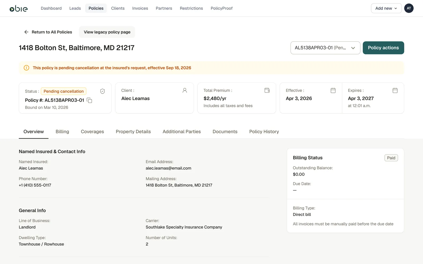
- One banner says what is happening to the policy, why, and when.
- Four cards hold the facts an agent checks first.
- Everything else moves into tabs, one subject each.
- Billing has one fixed home: balance, due date, and how to pay.
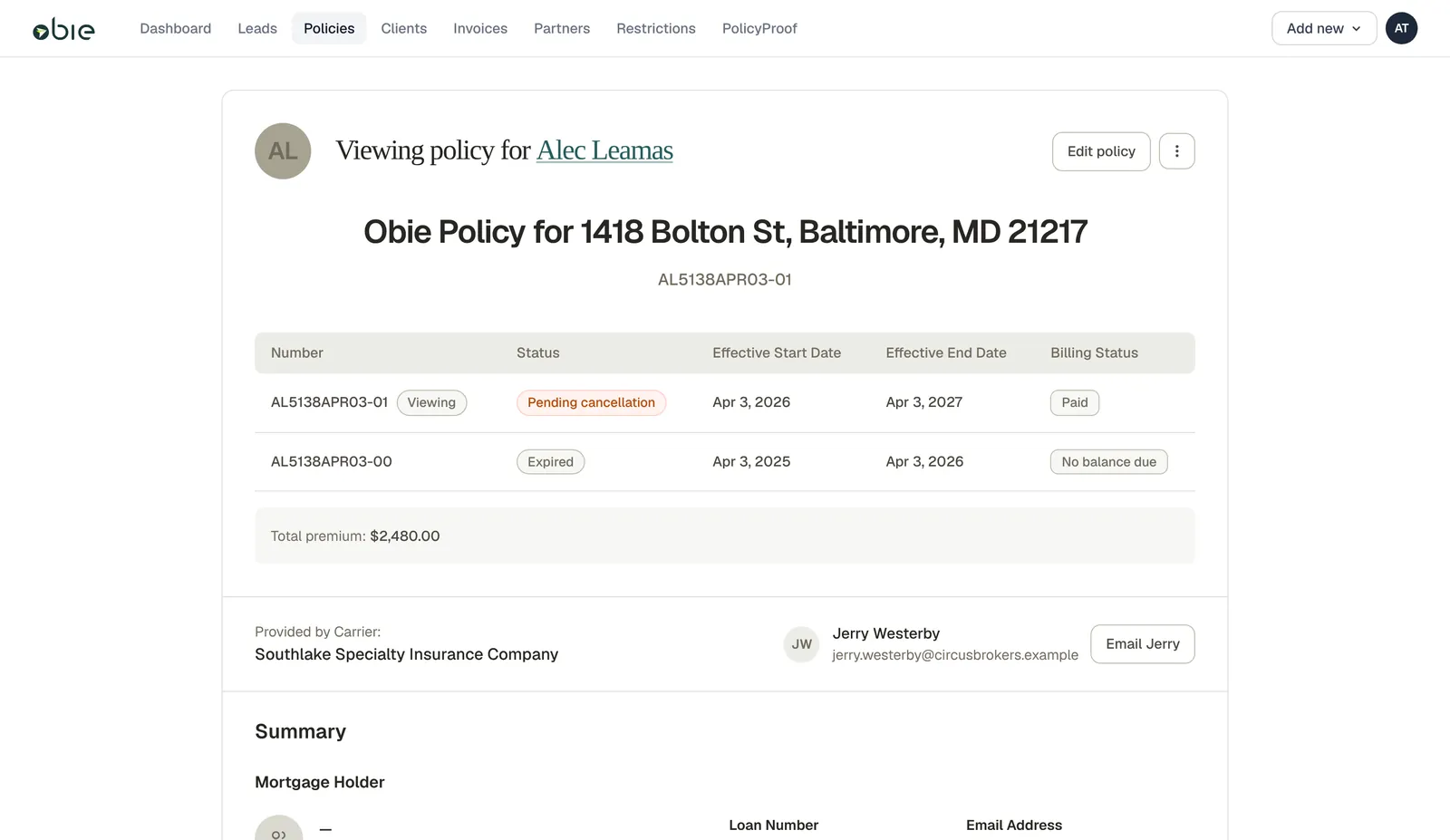
- A large title block uses a lot of space for very little information.
- Servicing actions hide behind a three-dot menu.
- A table of every term, date and status takes over the top of the page.
- “Pending cancellation” is a pill in a table row. No reason, no date.
The page everyone opened, and nobody could read
After a policy is bound, the policy page is where agents, clients and Obie’s own staff go to check on it. It drew about 20,000 visits a month, and it sat in the middle of nearly every servicing workflow.
It answered almost nothing at a glance. Was this policy cancelling? Why, and from when? What was owed, and when would autopay run? The answers were there somewhere, behind scrolling, a table of terms and a three-dot menu. So agents stopped looking and asked us instead.
- ~20k visits to the policy page each month
- 60+ agent requests a week about payment and billing
- ~30 a week about cancellations: the reason, the date, who started it
- ~9 a week about upcoming renewals and what to do next
The page also carried enough design and technical debt that small fixes were hard to justify. The brief put it well: there’s no point fitting a nice new shower head in a bathroom that needs a full remodel.
Answer three questions before anyone scrolls
Every one of those requests was a question the page could have answered. We wrote the first milestone around the three that came up most.
- What’s happening to this policy? Status, plus the reason and the date, in plain language.
- What’s owed, and when? Balance, due date and billing type, always in the same place.
- What can I do about it? The next action, named, one click away.
Six decisions that shaped the page
One banner, and it tells the truth
A status pill can only say “Pending cancellation.” The banner says why and from when, in a sentence an agent can read aloud to a client.
It also has to correct the status when the status is misleading. A policy that’s been cancelled and rewritten, or moved to a new carrier, shows a frightening status even though coverage carries on. In those cases the banner leads with the reassuring fact and links to the new policy.
We worked the copy line by line with underwriting and servicing. “Continue,” not “resume,” because resume implies a gap. Banners never stack, and each one belongs to a single term and audience.
Old pagePending cancellation



Money gets one home
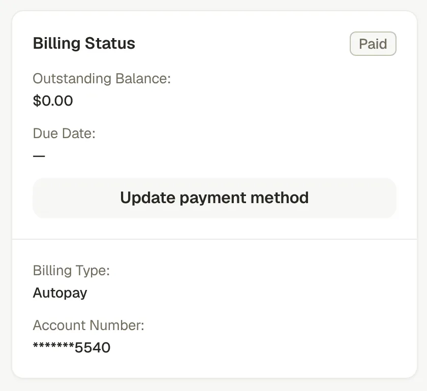
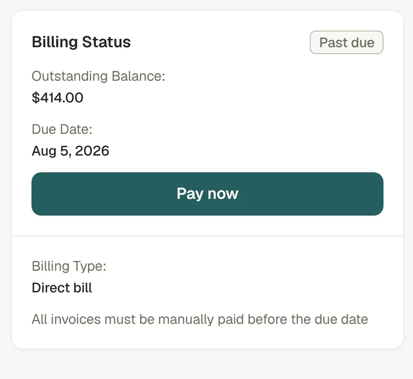
Early drafts stacked billing messages on top of status banners. Servicing asked us to keep payment collection from feeling pushy, so we split the jobs. Banners carry policy status only. Billing lives in one card, in the same spot on every policy, whatever state it’s in.
A paid-up policy shows a quiet card. A past-due one shows the balance, the due date and a Pay now button, without a banner shouting about it.
Four facts replace the term table
The old page opened with a table of every term, date and billing status. Most of the time an agent only needed one row of it.
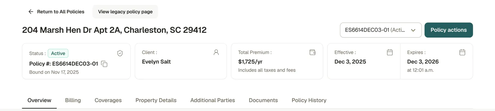
Now four cards hold what gets checked first: status and policy number, the client, the premium, and the effective and expiry dates. When nothing is wrong, the page stays this calm. It doesn’t invent a banner to fill the space.
Past and future terms move into a dropdown
Each term is listed with its own policy number and status. Opening a policy always lands on the term that’s in force today, even when a renewal or rewrite is waiting. The banner links forward to it.
Looking at a past or future term turns on a time-travel bar, so nobody mistakes last year’s numbers for this year’s.
Everything else gets a tab with one job
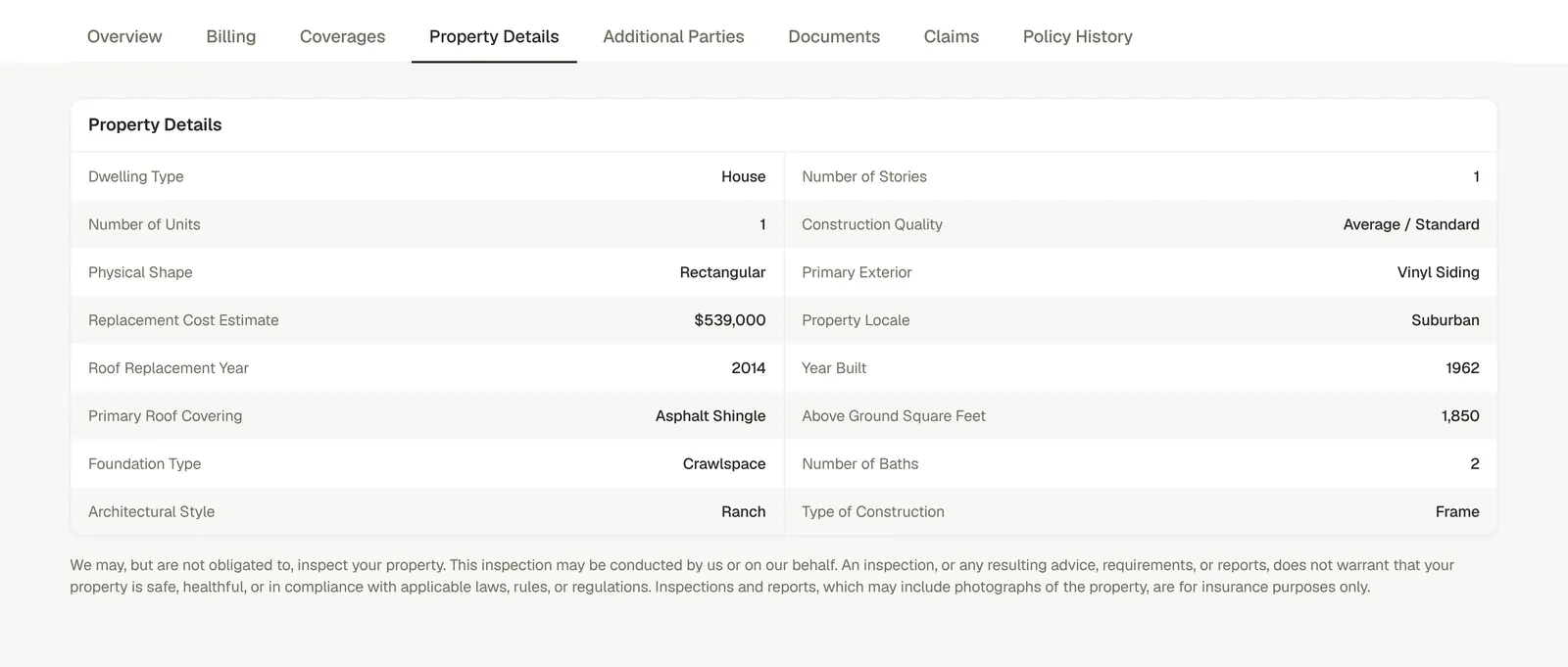
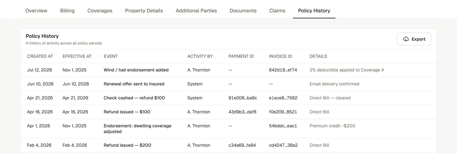
Coverages, Property Details, Additional Parties, Documents, Claims and Policy History each take what used to be scattered down one long page. Tabs with nothing in them disappear.
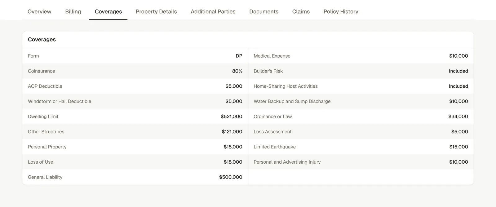
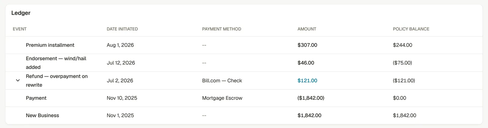
Two fixes for long-standing complaints: coverages printed exactly as the declarations page shows them, so nobody has to open a PDF, and a billing ledger with a running policy balance.
Ship it beside the old page
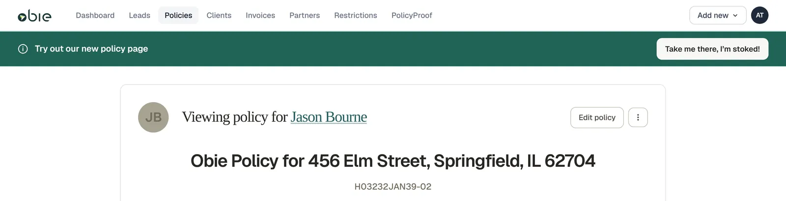
A page this central can’t change for everyone overnight. The plan is opt-in: the old page offers the new one, the new page keeps a “View legacy policy page” button, and people move across when they’re ready.
We designed the bridge as carefully as the destination, down to the button copy.
Engineering is building from the prototype
I built the design as a working app rather than a clickable mockup, on the platform’s real data shapes, with a fictional cast of policies covering every state in the spec. Engineering has the repository as well as the live link.
Engineering’s production spec is written from the prototype. The tab structure, the banner inventory word for word, the billing vocabulary and the ledger rules all carry straight across, down to example amounts taken from the prototype’s fictional policies. The first production pull request has merged: the page shell, the tab registry and all nine tabs, behind a feature flag. Engineering rebuilt it in the production stack; what carried across was the product, not the code.
“I wanted to build something eng could actually adopt instead of redo.”
| In the prototype | In engineering’s production spec |
|---|---|
| Nine tabs in a fixed order, hidden when they have nothing to show | The same nine tabs in the same order, each gated by who’s viewing |
| Banner copy and tones worked out with underwriting and servicing | A banner inventory with the same wording, line for line |
| Billing statuses: Payment due, Past due, Paid, No balance due, Refund owed | One shared vocabulary with the same five labels |
| A ledger with payments in brackets and a running policy balance | The same display rules, using the prototype’s example amounts |
| Agent, client and internal views of one page | Capabilities decide who sees each banner, tab and action |
| An invitation on the old page and a way back on the new one | A legacy/new switch saved per browser, defaulting to legacy |
- 10 weeks, first commit to approved design
- 119 merged pull requests
- 24 fictional policies, one for each state in the spec
- 5,214 automated tests passing
How this became the team’s workflow, three projects in, is Part Two →
From walkthrough to production code
First build: header, alerts and the first tabs
Full prototype walked through with the product team
Final stakeholder walkthrough of the first milestone’s specs and designs
Cross-functional sign-off requested on milestone one
Demoed company-wide with three live scenarios: a cancellation, a renewal offer and a conversion
Engineering’s production spec written from the prototype; first production PR merged behind a flag
Approved final design built end to end in the prototype
Engineering building the production page and billing ledger, with the prototype as reference
The real test comes after release. The measure that matters is the one we started with: how many agents still have to write in each week about cancellations, billing and renewals.
Next on the list: richer claims details, a policy history with filters and friendlier descriptions, and documents organised by term.
What I took from it
A status needs a sentence
“Pending cancellation” is data. People need to know why, from when, and whether they’re still covered. Pair every alarming status with the sentence that explains it.
Give money one place
When billing moves around depending on the policy’s state, people hunt for it. When it always sits in the same card, they glance.
Prototype in the real shape
Building on the platform’s real data shapes, with every state covered, meant engineering could adopt the work instead of redrawing it from a mockup.