Obie · Design QA · AI-Assisted Development

I built a tool that shipped 52 design fixes before launch

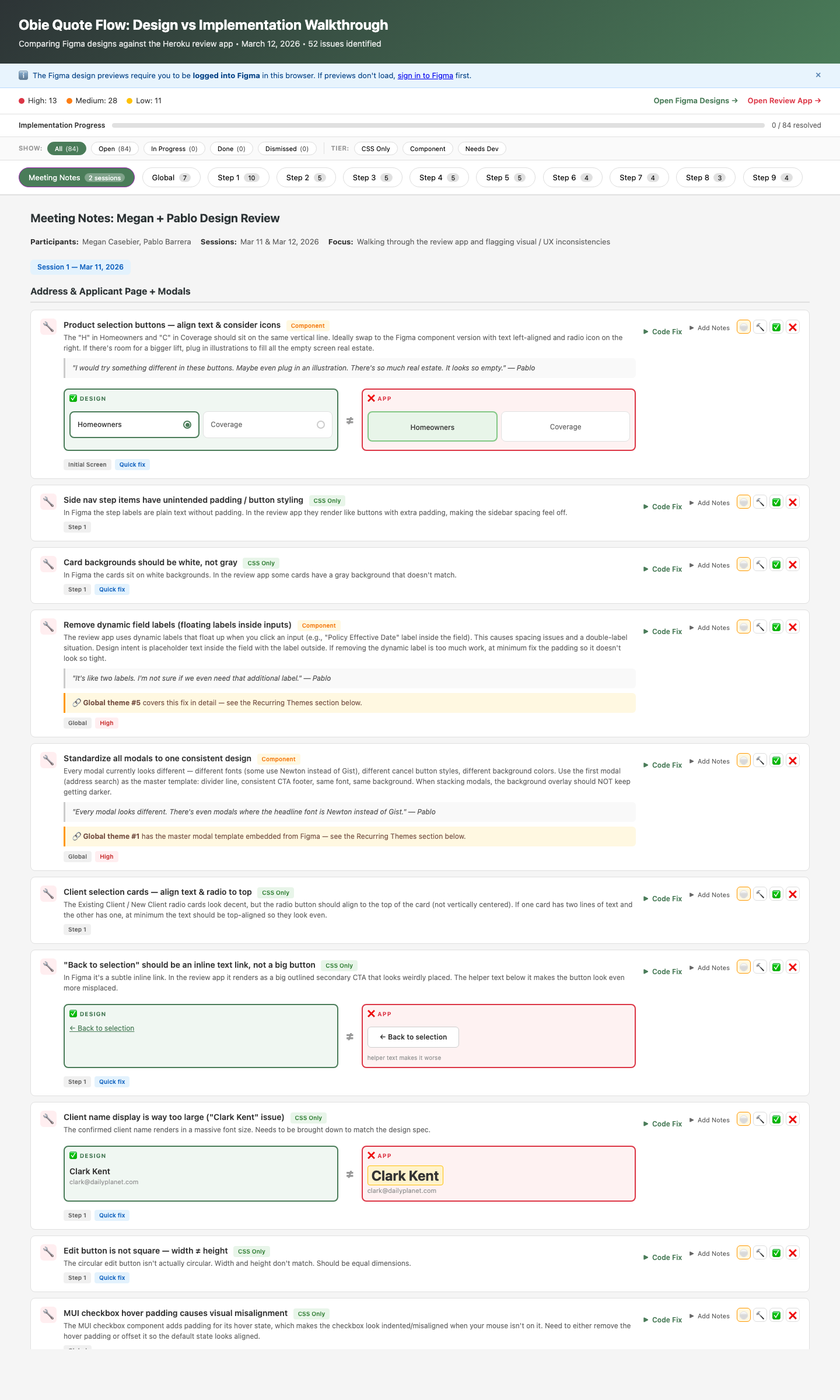
Our homeowners product was about to launch with dozens of design-to-code gaps. I recorded a design review with my UI designer, then built a tool that integrated our Figma designs and the live review app — and had AI analyze every screen to find inconsistencies we’d missed, identify systemic patterns, and generate fix-ready documentation that engineering could self-serve.

52 / 52
Issues resolved before launch
9 steps
Full quote flow audited
3 tiers
CSS-only, Component, Needs Dev
1 day
Built with AI-assisted development
QA walkthrough tool showing severity breakdown, progress tracking, filters, and issue cards with design-vs-implementation comparisons
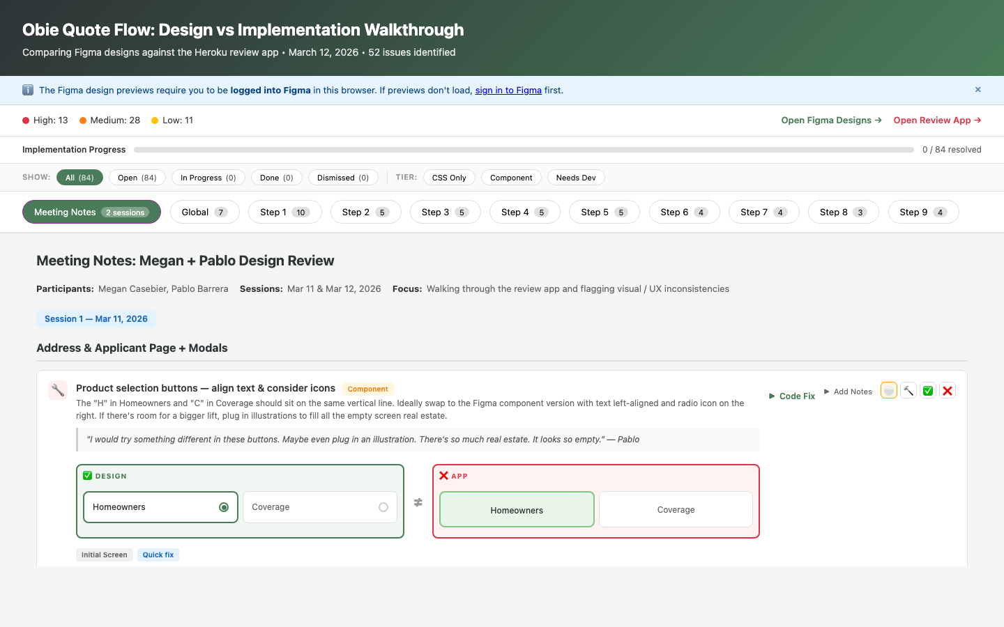
The live QA walkthrough — severity stats, progress tracking, step-by-step navigation, and side-by-side design comparisons
Role
Sole UX Designer & Tool Builder
Timeline
1 day to build, used through launch
Team
4 engineers, 1 PM, 1 TPM
Built With
HTML/CSS/JS, Claude Code, Netlify

Design QA was broken. Not the designs — the process.

Obie’s homeowners insurance quoting system was weeks from launch. I’d designed a 9-step quote flow, and engineering had built it. But as implementation progressed, gaps appeared — wrong typography, missing component states, inconsistent spacing, colors that didn’t match the design system.

This is normal. Every product has a gap between Figma and production. What wasn’t normal was our process for closing it.

How Design QA Usually Works
  • Designer files Jira tickets for each issue
  • Tickets sit in backlog behind feature work
  • Engineers context-switch to find the right Figma frame
  • Back-and-forth in comments: “which screen?” “what size?”
  • Issues trickle in over weeks; some ship unfixed
  • Nobody has a clear picture of total scope
What I Built Instead
  • One interactive tool with all 52 issues documented
  • Side-by-side Figma vs. live app for each step
  • Severity coding: High / Medium / Low
  • Fix tier: CSS-only, Component, or Needs Dev
  • Paste-ready code suggestions for every issue
  • Status tracking so everyone sees progress

The bottleneck wasn’t engineering capacity. It was information architecture.

Engineers weren’t ignoring design fidelity — they didn’t have a good way to see it. The information was scattered across Figma comments, Slack threads, and Jira tickets. No one could answer the basic question: “How many issues are there, and how close are we to done?”

I realized this wasn’t a design handoff problem. It was a design operations problem. And the solution wasn’t more tickets — it was a tool.

An interactive QA walkthrough that engineers could self-serve

Using Claude Code for AI-assisted development, I built a production-grade QA tool in a single day. Not a prototype. Not a slide deck. A live, deployed application that the team used daily through launch.

Issue cards showing design vs app comparisons, severity badges, tier classifications, code fix buttons, and status tracking
Issue cards with design-vs-app comparisons, severity coding, quote attribution from design review sessions, and inline status tracking

Split-view comparison

Figma design embedded side-by-side with the live review app for each of the 9 quote flow steps. No more switching between tabs.

52 issue cards with severity

Every gap documented with type (Text, Missing, Different, Extra), severity (High/Medium/Low), and fix tier (CSS-only, Component, Needs Dev).

Paste-ready code fixes

Each issue includes “What to change,” “Where to look,” and a copy-paste Claude Code prompt so engineers can fix issues without a design handoff meeting.

Status tracking with persistence

Four states per issue (Open, In Progress, Done, Dismissed) with localStorage persistence. A progress bar shows resolution rate in real time.

Keyboard navigation

Arrow keys and number keys for fast step switching. Built for engineers who live in the terminal.

Meeting notes & recurring themes

Design review session notes embedded in the tool, plus 6 global themes (modal standardization, typography scale, component states) that cut across individual issues.

1
Build a tool, not a spreadsheet
Why I invested a full day building an app instead of filing 52 tickets

The standard process would be filing each issue as a separate 1-point Jira ticket. That’s 52 tickets — each needing screenshots, Figma links, implementation guidance, grooming, assignment, and back-and-forth comments. At ~15–20 minutes of overhead per ticket (writing, triaging, context-switching), that’s 13–17 hours of ticket management alone — scattered across sprints — before a single pixel changes.

One day of building replaced all of it. No tickets. No grooming. No “which Figma frame?” comments. A single front-end engineer resolved all 52 issues between planned tickets over the course of one sprint — without taking away from any planned work. The tool made each fix so self-contained that an engineer could pick one up in a 15-minute gap, paste the code suggestion, and move on.

2
Severity + tier classification over flat lists
Helping engineers prioritize without a meeting

Not all design gaps are equal. A wrong hex color is a 30-second CSS fix. A missing component state might require new logic. Treating them the same wastes engineering time on triage.

Every issue got two dimensions: severity (High/Medium/Low — how visible is this to users?) and tier (CSS-only/Component/Needs Dev — how much engineering effort?). Engineers could filter to “show me all High-severity CSS-only issues” and knock out the highest-impact, lowest-effort work first.

Why this matters

13 of the 52 issues were High severity. 11 were CSS-only. Engineers cleared all CSS-only issues in a single sprint, getting visible polish wins out the door fast while planning the deeper component work.

3
Code suggestions, not just visual redlines
Meeting engineers where they work

Traditional design QA hands over screenshots with annotations: “this should be 16px not 20px.” The engineer then has to find the right file, the right component, the right CSS rule. That translation step is where fixes stall.

Each issue card includes a collapsible code section with: what specifically to change, where in the codebase to look, and a paste-ready prompt for AI-assisted fixes. I didn’t just identify problems — I reduced the cost of fixing them to near zero.

I designed a QA system that combined human review with AI analysis

I’m not an engineer. I don’t write production application code. But I’ve integrated AI-assisted development into my practice using Claude Code — and for this project, the AI wasn’t just the builder. It was the analyst.

Step 1 — Record the design review

Pablo and I walked the Heroku review app together, recording our conversation

My UI designer Pablo and I walked through the live review app screen by screen, talking through every element that felt off. We recorded the session so nothing was lost — our observations, Pablo’s gut reactions, specific callouts on spacing, color, and component misuse.

Step 2 — Integrate both sources into the tool

Built a tool that embedded both the Figma designs AND the review app

Using Claude Code, I built an interactive walkthrough that embedded the Figma design file and the Heroku review app side by side for each step of the quote flow. This wasn’t a static comparison — it was a live, navigable audit environment.

Step 3 — AI-powered screen-by-screen analysis

The AI analyzed each screen and found issues we missed

I had Claude Code analyze the Figma designs against the review app screen by screen. It identified inconsistencies that Pablo and I hadn’t caught — subtle spacing differences, wrong font weights, missing hover states, component variants that didn’t match the design system. Then I fed in our recorded review notes, and the AI applied our human judgment to rank and contextualize its findings.

Step 4 — Pattern recognition across screens

Identified global issues that could be fixed once

The most powerful step: I had the AI analyze which inconsistencies were systemic rather than one-off. It identified recurring themes — like sizing and alignment being off across multiple screens because engineering had miscoded the typography scale. Instead of filing the same fix 15 times, we identified 6 global patterns where a single code change would cascade across the entire flow.

Step 5 — Deploy and share

Deployed to Netlify and dropped the link in Slack

No meeting. No handoff deck. Engineers opened the tool, filtered by severity and tier, and started fixing. By the next morning, issues were already being resolved.

Why this matters for my practice

This wasn’t “AI built a thing for me.” This was a designer orchestrating AI as an analytical tool — combining human judgment (Pablo’s eye, my design review notes) with machine analysis (screen-by-screen comparison, pattern recognition) to produce something neither could do alone. The AI found issues we missed. We provided the context to rank them. The tool made the fixes self-serve.

52 out of 52 issues resolved before launch

Previous releases
  • Design QA happened in the last week — if there was time
  • Issues filed as 1-point Jira tickets, scattered across sprints
  • 15–20 known design gaps shipped to production per release
  • Engineers context-switched between Jira, Figma, and the app
  • No shared visibility into total scope or progress
This release
  • Zero design gaps shipped to production
  • Zero Jira tickets filed — zero sprint capacity consumed
  • One front-end engineer fixed all 52 issues between planned tickets
  • No handoff meetings, no grooming, no sprint disruption
  • Real-time progress bar — everyone could see the state

More UI fidelity work shipped pre-launch than any previous Obie release. The tool didn’t just track issues — it changed the team’s relationship with design quality.

The clearest signal: engineering proactively asked me to build one for the next feature release. Design QA went from an afterthought that happened in the last week — if there was time — to something the team expected and planned around.

The math

52 issues that would normally be 52 individual 1-point Jira tickets, each requiring grooming, assignment, and context-switching. Instead: one front-end engineer fixed every issue between planned tickets in a single sprint, with zero disruption to the roadmap. The tool cost one day to build. It shipped a product with zero known design gaps and created a repeatable process that engineering now requests by default.

What this project taught me about design leverage

As the sole UX designer supporting four product teams, I can’t be in every room, on every PR, at every standup. The highest-leverage thing I can do isn’t design more screens — it’s build systems and tools that carry my design intent forward without me in the room.

The QA walkthrough is one example. The design system is another. The pattern is the same: invest upfront in the thing that scales, so the quality compounds instead of eroding.

What I’d do differently

The AI analysis wasn’t perfect. It flagged issues that weren’t actually problems — false positives from dynamic rendering states and responsive breakpoints that looked different from Figma but were intentional. I manually reviewed every finding before sharing with engineering, which added time but was essential for credibility. If the tool had shipped unvetted AI output, the team would have stopped trusting it after the first false alarm.

The first version was also tightly coupled to this specific feature — hardcoded steps, hardcoded Figma embeds. For the next release, I’m building a more modular version that any designer could populate without rebuilding the app from scratch. The goal is to make this a repeatable part of our release process, not a one-time heroic effort.

← Back to all work