Prototypes, end to end
This year, a clickable prototype went from a last-resort trick to the first move on every project I touched. This is how that happened, one project at a time.
- Role
- Product designer
- Timeline
- Dec 2025 – Oct 2026
- Projects
- Coverage sliders · Partner restrictions · A core account page · Underwriting workbench
A lot of this site is about handoffs. The handoff was never the point. It was a side effect.
The prototypes existed anyway. The real story of the year is what they were for. First they helped me understand a problem by walking it. Then they let stakeholders feel a flow, the things that just don’t feel the same when they’re laid out in frames. Then, because they were going to exist anyway and they were built in code, the question became whether engineers could adopt the code.
This is the long version. It starts with an engineer who couldn’t get a design file to say what he meant, and it ends with prototypes built well enough that engineering builds from them instead of around them. In between, the thing itself climbed three rungs.
-
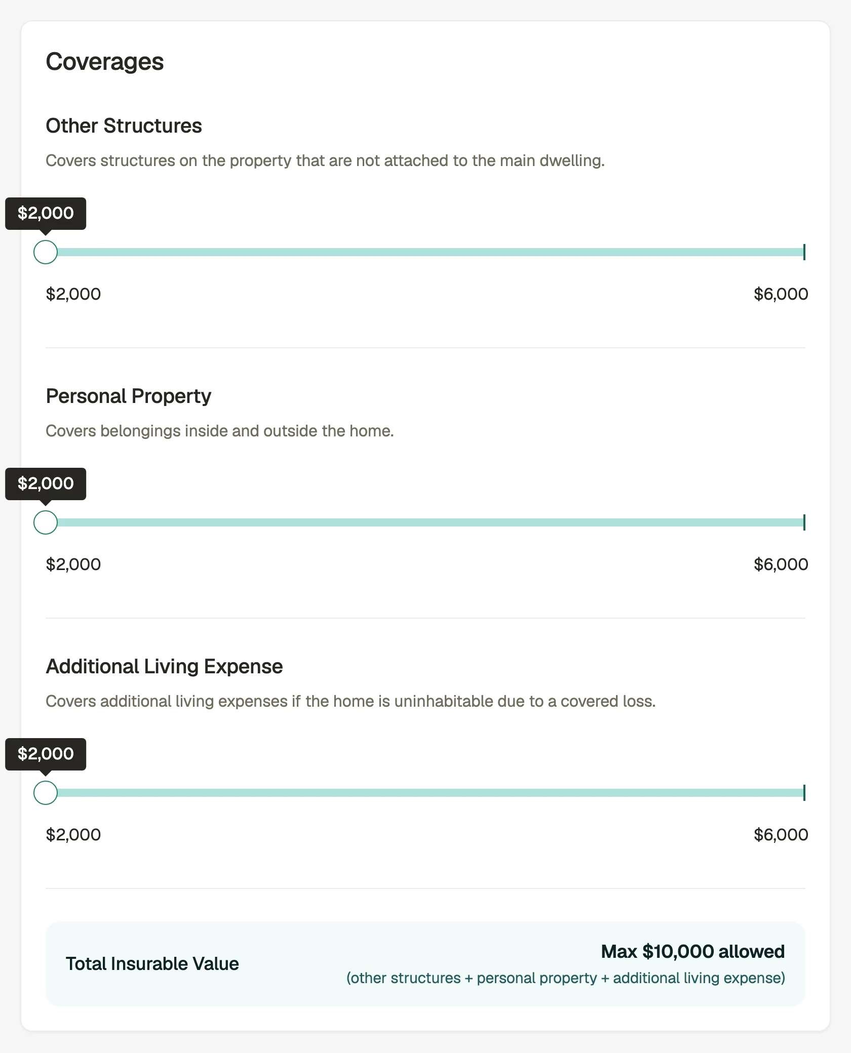
Rung one · February 2026Hand-written HTML
For: making an underwriting limit felt instead of read. Couldn’t yet: be more than one file, nothing an engineer could adopt as-is.
-
Rung two · Mid-2026Tooled prototypes
For: the review surface product, design and engineering all pointed at. Couldn’t yet: hand engineering code it could adopt as-is.
-
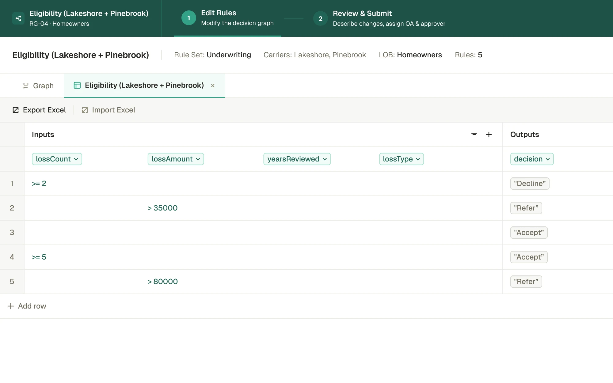
Rung three · October 2026Builds an engineer can pick up cold
For: being picked up cold by someone who was never in the room. Couldn’t yet: be the code that ships. It’s design work an engineering pod is now building from.
An engineer asks
It started with an engineer, not a designer. In December 2025, an engineer messaged me about an idea the agency-development team wouldn’t consider “without seeing some mocks first.” He’d already tried:
Direct messageDec 9, 2025
An engineer
I created something in figma, but I think the important aspects of the functionality are more nuanced and beyond my figma skills.
He named the problem before I did. The important part was behavior, and flat frames can’t carry behavior.
It’s easy to hear that message as a request for better mocks. It wasn’t. He had mocks. What he couldn’t draw was the part of the idea that only exists when someone’s hand is on it: what happens when you push a value too far, what the screen does instead of letting you, and how it tells you why. A frame shows a state. His idea lived between states.
That gap is what every chapter on this page is about. Frames are very good at getting people to agree on what a thing looks like. They’re quiet about what it does, and in insurance software, what it does is usually a rule: a limit, an eligibility check, a coverage that can’t exceed another. When the rule is the product, a picture of the product leaves the product out.
The first sign that the medium was the bottleneck came from an engineer asking a designer to go past it.
An argument settled by a click
In January, product and engineering disagreed about how agents should set coverage limits that share one total: a modal that checks the math after the fact, or controls that adjust as you move them.
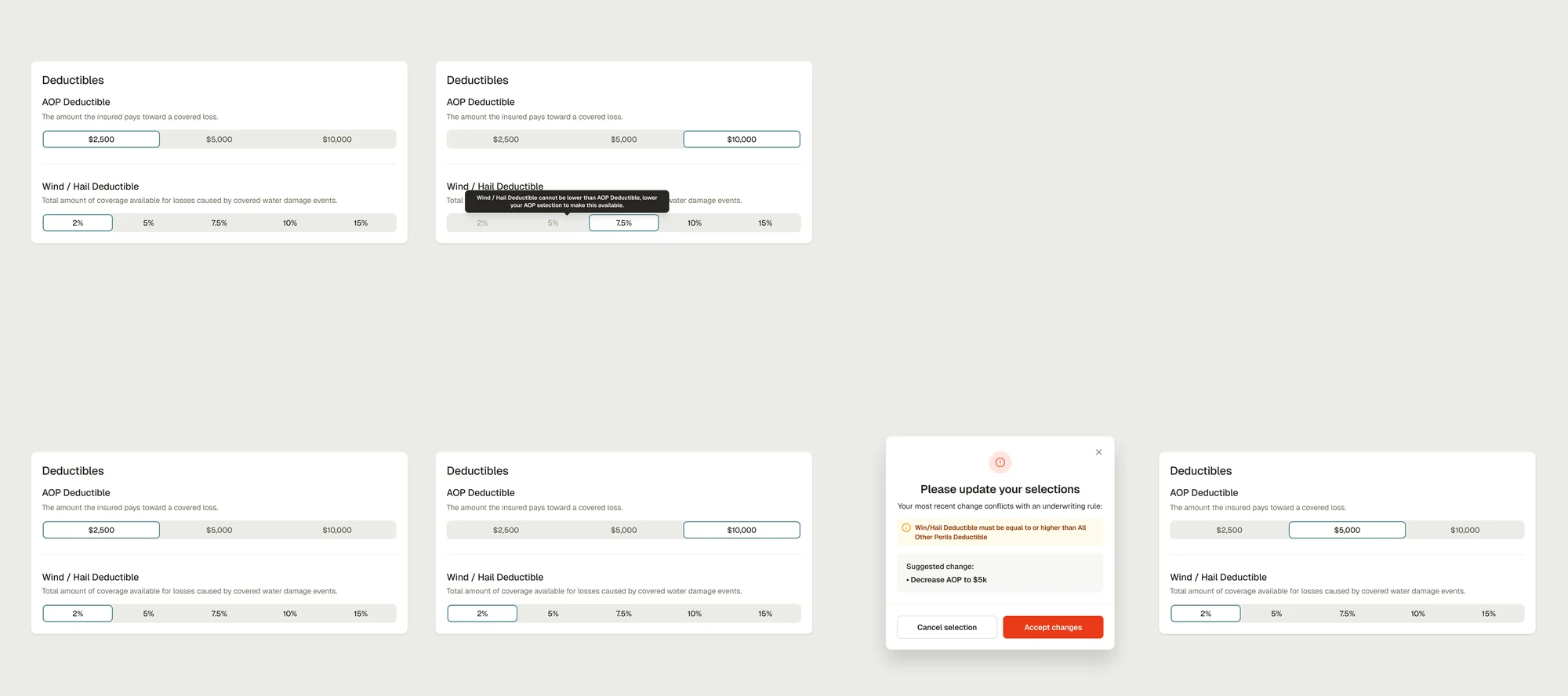
Frames like these could show both answers. They couldn’t show what either one felt like to use.
Side by side, the difference is easy to state and hard to feel. The modal is one dialog. The controls are a set of components that all have to know about each other. What a still frame can’t show is the sequence: in the bottom row the agent makes a choice, the screen accepts it, and then the screen takes it back. Every round trip is a small broken promise, and you only notice it with your hand on the mouse.
On January 16 I proposed a pattern with a working prototype attached. On January 21, a hand-written HTML prototype, made before any of the tooling I use now, reached the engineer who would end up championing it:
Direct messagesJan 21, 2026
Engineer
lol, where the hell did you get that? Has [our design director] been vibe coding again?
Me
the html proto thing?
Engineer
haha, yes
Me
that was meeeeeeee
Engineer
boss
Moments later
Engineer
Now that I have the context, I should be good.
Nobody had to be argued into anything after that. Everyone could click the same thing.
Look at his first question, though. It wasn’t whether the pattern was right. It was who made it, and the guess was someone other than the designer, because a working thing in a browser read as somebody else’s job. That assumption is what the rest of the year took apart: design hands over pictures, and someone else makes them real.
A prototype doesn’t win an argument by being persuasive. It wins by making the argument unnecessary.
The prototype goes to the room
By February 4, the prototype wasn’t an attachment. It was the pitch: a Loom, the Figma file, and two clickable prototypes on Netlify, with one stated goal.
Share postFeb 4, 2026
Me · the goal
make these rules visible and predictable for users, without making them read + memorize the underwriting rules.
- Loom
- Figma file
- Coverage sliders · Netlify
- Wind/Hail deductibles · Netlify
The whole design is in that goal. Visible: the agent sees the rule before they break it, not after. Predictable: what the screen does next is never a surprise. And the last clause carries the most weight: without making them read and memorize the underwriting rules. The people using this are agents in the middle of a quote. They aren’t going to study a rulebook, and they shouldn’t have to. The interface should know the rule so the agent doesn’t have to.
The design file shows how I got there.
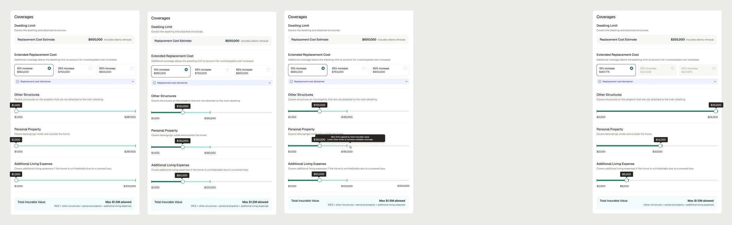
Read it left to right and the direction only goes one way: each pass moves more of the rule into the control itself. In the first, every slider runs its full length, and the shared total is a line of text at the bottom. By the second, each rail stops where the total runs out. The third adds the sentence a rule owes you when it says no: “Max limit capped by total insurable value. Lower other limits to increase available coverage.” The fourth carries the same idea up into the options above, where choices the total can’t afford turn gray before anyone picks them.
Here is the sliders prototype, exactly as it was then. Move one and watch the others give way. Its rawness is the date stamp.
Push any slider to its ceiling and it explains itself, in the prototype’s own words: “This selection is being limited in real time based on your selections for the limits to ensure the total doesn’t exceed the predefined $10K maximum.” Past the ceiling, the rail goes gray, and the number at its end moves to wherever the ceiling is now. Nothing on the screen ever lets you ask for something the total can’t give.
It’s one file, written by hand, with the styles and the logic in the same place. An engineer couldn’t adopt a line of it. That wasn’t its job. Its job was to put the behavior in front of the people deciding, so they could argue about the feeling instead of the frames, and it did.
The sliders shipped in June 2026. The engineer implementing them from my demo put the result at “95% there.”
A rule you can feel is a rule nobody has to memorize.
The engineer as stakeholder
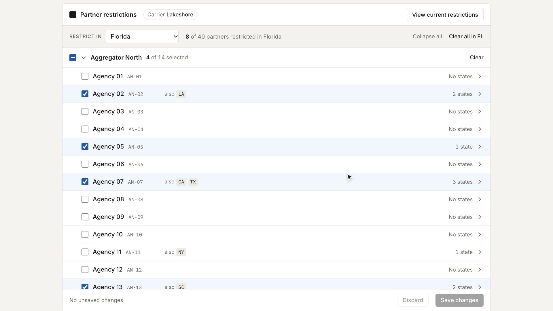
Partner restrictions started the other way around. Engineering brought the requirements, for an internal task, and I prototyped to understand them. I sent the first version back with one question: is this even what you meant?
That question is the best reason I know to build first. A requirements doc and a prototype can say the same thing, but only one of them can be wrong in a way its reader can see. Engineering could open my version, click through it, and show me exactly where my reading parted from theirs. The prototype wasn’t my proposal. It was my understanding of their proposal, made checkable.
On March 2, I saw an engineer’s build of one of these prototypes, with the code layer under it, for the first time. I answered in capitals:
MessageMar 2, 2026
Me
SO COOL TO SEE THE CODE LAYER
It reads like a small thing. It was the first time I could see that what I made and what engineering made were the same kind of material, and that the distance between them could be closed by editing instead of by starting over.
By September, the prototype was the review surface. Feedback came back as lists written against the prototype link. Product, design and engineering were all pointing at the same clickable thing.
- ProductA feedback list
- DesignA feedback list
- EngineeringA feedback list
Written against one link: the prototype
That changes what review is. A comment on a frame is about a picture of a decision. A comment written against a link is about the decision itself, at the fidelity it will ship at, and anyone can reproduce it by clicking where the reviewer clicked. Restrictions shipped in October 2026.
When everyone reviews the same running thing, there’s nothing left to translate.
Try the pattern
The restrictions editor is a working demo now. Change the state, select every partner under one aggregator, take one back out, save, and read the result back by state. The original ran on employer infrastructure; this is a fresh rebuild of the pattern.
Most of the design is in the small print. Partners sit under the aggregator they come through, because that’s how restrictions actually get applied: often to a whole group, minus one. The state you’re editing is always in hand at the top, with a running count of how many partners are restricted there. A partner restricted somewhere else says so on its own row, so nobody clears a restriction they didn’t know existed. And nothing saves until you say so: the footer keeps track of unsaved changes, with a way to discard them. Details like these are what a requirements list leaves out and a click finds.
The practice formalizes
Until then, the prototypes were mine the way a sketchbook is mine: useful, persuasive, and held to whatever standard the day allowed. A core account page was the first one built to be inherited, so it needed law before it needed screens: twenty-four fictional policies, one for each state in the spec; a law that no real data enters the repository; and dated figures, so nothing claims to be current when it isn’t. The conventions went in before the first line of application code did.
Each of those rules answers a question an inheritor would ask. Can I trust what this screen shows? Yes, because every value on it is invented on purpose and labeled that way. Can I share it? Yes, because nothing real is in it to leak. Is this number still true? The date beside it says when it was. A prototype that can answer those questions without me in the room is a different kind of object from one that can’t.
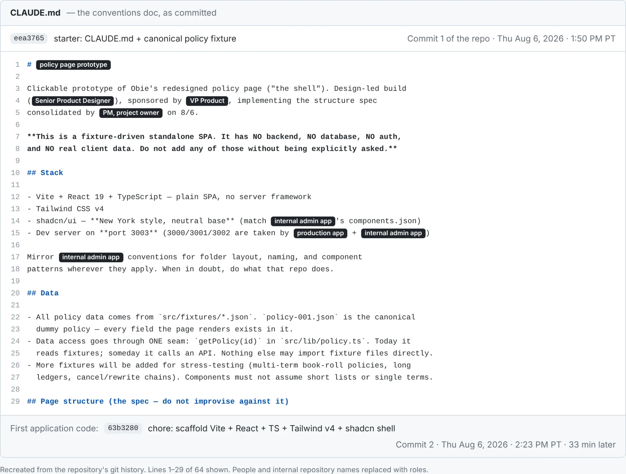
The underwriting workbench added the handoff bundle and the test that mattered: an engineer I’d barely worked with matched the design in about a day, from the bundle and the design file, with no meeting and no Loom. The rules engine and the delivery system own that story.
The quote builder is the product the old way nearly cost us, told as craft: the agent quote builder.
A prototype someone else will build from has to be held to the standard of the thing it becomes.
They exist anyway
Somewhere in there the question turned around. The prototypes were already in code. Homeowners had shipped with design-to-build inconsistencies that a QA pass had to catch after the fact. If these prototypes were going to exist anyway, could I make the code easy for engineers to adopt?
The old answer to “what happens to the prototype” was: nothing. It did its job in the room, engineering started over from the frames, and the gap between the two became QA’s problem. Nobody did anything wrong. That is what rebuilding from pictures produces.
Before
- Prototype, for the room
- Frames and a spec
- Engineering rebuilds
- QA finds the drift
After
- Prototype, built to be inherited
- Handoff bundle
- Engineering builds from it
- The build matches
The difference between the two rows isn’t effort. Both have four steps, and both end in a build. The difference is what travels. In the first row, the prototype’s knowledge has to be re-described in frames and a spec, then re-read by someone who wasn’t there, and each retelling loses a little. In the second, the thing that gets handed over is the thing that was reviewed. The delivery system’s thesis started here: it looks like a prototype. It’s built like a product.
That question is where the delivery system was born.
The process now
Every project now has a prototype at every stage.
- DiscoveryA clickable wireframe. Understand the problem by walking the flow.
- AlignmentStakeholders click instead of squinting at frames.
- BuildThe prototype is the spec’s reference.
- AdoptionHandoff bundles, and builds that match.
Each stage on that list was a chapter above before it was a habit. Walking the flow is the restrictions question, is this even what you meant. Clicking instead of squinting is January. The prototype as the reference is the core account page, and builds that match is the workbench.
Downstream, it shows up in other people’s words.
Launch-testing sign-offOct 2026
An agency-development stakeholder, on the latest descendant
The overall experience is a major upgrade.
The latest of these is on the homepage: Tidemark, a working prototype for a lender that doesn’t exist, with its source public on GitHub. The rules engine’s pattern is live too: the rules wrapper, a working demo with its source.
If you want to try this on your own team, here’s where I’d start, one lesson per chapter:
- Build the behavior, not the picture. If the important part is what the screen does, a frame will leave it out.
- Put the prototype where the argument is. A thing everyone can click ends debates that a deck would only prolong.
- Send it back with a question. A prototype of someone else’s requirements is the fastest way to find out you misread them.
- Review against the link. Feedback on the running thing is reproducible; feedback on a frame is a description of a description.
- Write the rules before the screens. Fictional data, no real data, dated figures. That’s what makes a prototype safe to inherit.
- Assume it will exist anyway. Then build it so the next person can use it instead of redoing it.
None of it replaced the conversation. It changed what the conversation is about. In December, the conversation was about what an idea might do. Now it starts with the idea doing it.
We can design the feeling from the very beginning now.
Building something in this lane? Email me.