From 496 quote requests to one list of people and homes
When Obie opened its platform to independent agents, the page they’d live in was built for our own brokers. I redesigned what it was organized around. Three years later, it’s one of the most-used pages in the product.
- Role
- Senior Product Designer, research and design lead
- Timeline
- Apr – Dec 2023, then ongoing
- Team
- A PM, engineering, agency distribution, risk, marketing and support
- Status
- Live since December 2023
The page agents would live in
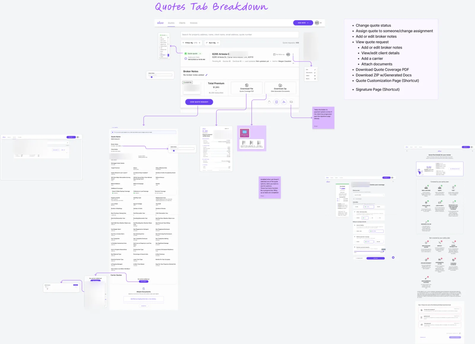
Before 2023, quotes at Obie lived on a Quotes tab built for our internal brokers. Every quote request got its own card. Every card carried about a dozen jobs:
- change the status, by hand
- assign it
- broker notes
- view the request, client details
- add a carrier, attach documents
- download the coverage PDF, a ZIP of generated documents
- shortcuts to customization and signature, behind a row of unlabeled icons
Its main button opened a long page of raw underwriting answers.
That worked for a handful of brokers who knew it by heart. It wasn’t going to work for independent agents, who were about to become the people using it most. In research with more than ten people across brokers, agents and internal staff, the clearest finding was how fragmented agents’ days already were: each property ran through three to five different portals. Ours couldn’t be another one they had to decode.
The reframe: agents don’t manage quote requests
The old page counted 496 quote requests. But an agent doesn’t think in quote requests. They think about a client and a property, and about what happens next. Re-quote the same house three times and the old page showed three strangers.
So the Leads tab is organized around the lead: one client, one address. Every quote version for that property sits under it, with the most recent one forward and the rest one tab away.
That’s a decision about the data, not the layout, and engineering built to it. Quote versions became something the system groups, not something an agent has to remember.
Before: a card per quote request
- Quote request · Elm Street
- Quote request · Elm Street
- Quote request · Elm Street
After: a card per lead
Elm Street, for one client
- Current quote
- Previous quote
- Previous quote
Status became a system, not a dropdown
On the old tab, a person set the status by hand, so it was only as true as the last person to touch it. The Leads tab derives it: Quote Started, Active, Declined, Expired, Signed, Bound. Nobody sets it; the quote’s actual state does.
Getting there meant mapping the cases nobody draws until they happen:
- an agent who starts a quote and never finishes
- one who comes back in under 60 days, or after 61
- a quote declined, then re-run successfully
- a lead that expires and is run again
Expired leads and expired quotes look the same to an agent, but stay separate in the data for reporting. A lead shows a date; a quote shows a date and time.
One button that knows where you’re going
The old card’s main action opened a data dump. The new one is a single button, Continue to Quote, that takes the agent wherever that lead needs to go next:
| The lead’s state | Continue to Quote takes you to |
|---|---|
| No package chosen yet | The package selection screen |
| Required fields missing | Quote customization |
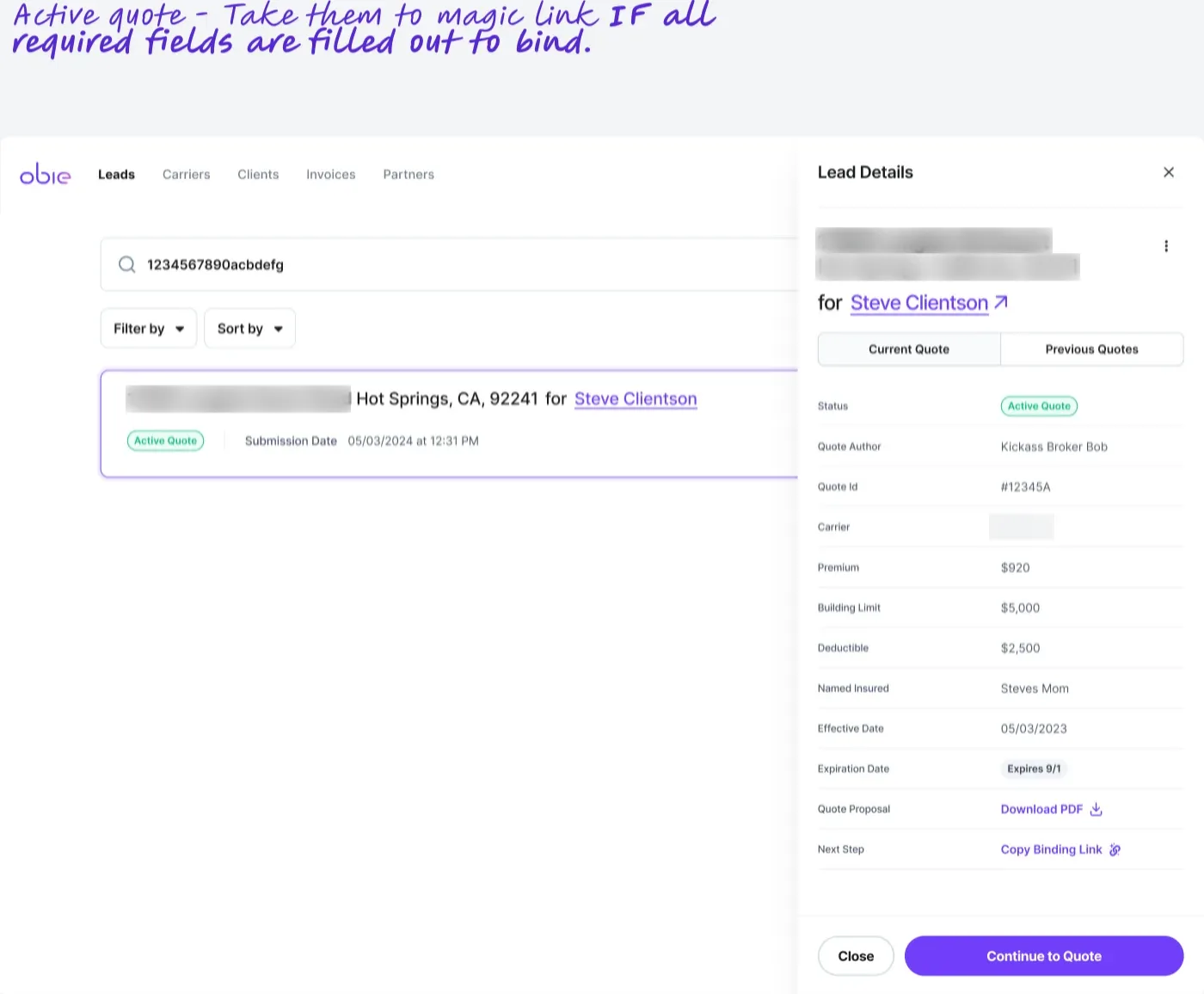
| Ready to bind | The binding link, ready to copy |
| Signed | Payment |
| Bound | The policy |
| Expired | Regenerate the quote |
| Quote started, or declined | Nothing to do yet, so no button pushes you anywhere |
The rest moved into a details drawer: carrier, premium, limits, deductible, effective and expiry dates, the quote PDF, and the next step, in that order. That’s the order an agent checks them in.
“The leads tab drawer is much more accessible for IAs.”
What we took away
About a dozen card actions didn’t make the move:
- manual status
- assignment
- broker notes
- the ZIP download
- the icon shortcuts
Research showed nobody was using them, and the team worked through each removal in an open session, so nobody was surprised on launch day.
Launch had bumps. In the first weeks, staff and agents told us bound policies were harder to reach from the new tab than the old one, and we changed how previous quotes behave by February. Support questions about where a quote stood dropped after launch.
Three years later
The Leads tab went live for everyone, independent agents included, on December 19, 2023, alongside Sign & Bind, with an in-app announcement, tutorial videos and an email. I’ve kept working on it: the quote-history logic in 2024, a revamp round that spring, and a brand refresh in 2025 that I directed with our UI designer on visuals.
In the last 90 days (to October 17, 2026):
- About 8,300 agents and brokers used it, against 167 Obie staff.
- It’s the third most-viewed page in the product for people outside Obie, at about 205,000 views. Only the broker quote form and the policies list get more.
- Continue to Quote is its most-used control, at about 46,700 clicks from roughly 4,800 people. That’s almost three times the next labelled action on the page.
- Its audience keeps growing. That’s up about 29% on the 90 days that started a year earlier (Oct 2025 – Jan 2026).
None of the removed actions show up among the page’s most-used controls today. Nobody went looking for them.
Credits
Made with a product manager, engineering, agency distribution, risk and underwriting, marketing and support, and a second designer who contributed alternative UI explorations. All data shown is fictional.